In this post, We will explore more examples of Data Visualization using R. For that purpose we are using mtcars as dataset
here is a list of all the features of the observations in mtcars:
- mpg — Miles/(US) gallon
- cyl — Number of cylinders
- disp — Displacement (cu.in.)
- hp — Gross horsepower
- drat — Rear axle ratio
- wt — Weight (lb/1000)
- qsec — 1/4 mile time
- vs — V/S engine.
- am — Transmission (0 = automatic, 1 = manual)
- gear — Number of forward gears
- carb — Number of carburetors
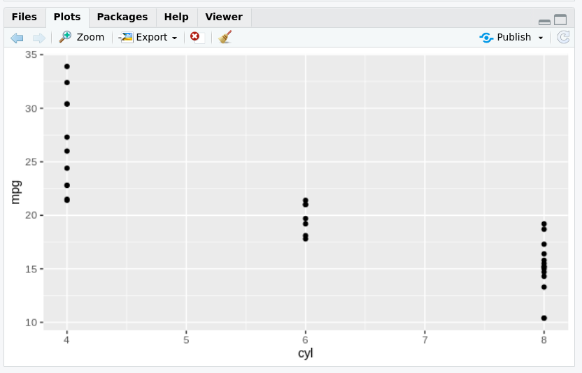
Example 1: Plot graph on X and Y axis
# include ggplot2 library
library(ggplot2)

# 1 - Map mpg to x and cyl to y
ggplot(mtcars, aes(x=mpg, y=cyl)) +
  geom_point()

# 2 - Reverse: Map cyl to x and mpg to y
ggplot(mtcars, aes(x=cyl, y=mpg)) +
  geom_point()
OutPut:
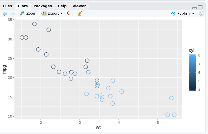
Example 2: Change the color, shape, and size of the points
# include ggplot2 library
library(ggplot2)

#chnage color,shape and Size
ggplot(mtcars, aes(x=wt, y=mpg, col=cyl)) +
  geom_point(shape=1, size=4)
OutPut:
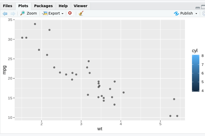
Example 3: Add alpha and fill
# include ggplot2 library
library(ggplot2)
# Expand to draw points with alpha 0.5 and fill cyl
ggplot(mtcars, aes(x = wt, y = mpg, fill = cyl)) +geom_point(alpha=0.5)
OutPut:
Exercise 4: Change Shape and color
library(ggplot2)
# Change shape and color
ggplot(mtcars, aes(x = wt, y = mpg, fill = cyl)) +geom_point(shape=24,col="yellow")
OutPut:

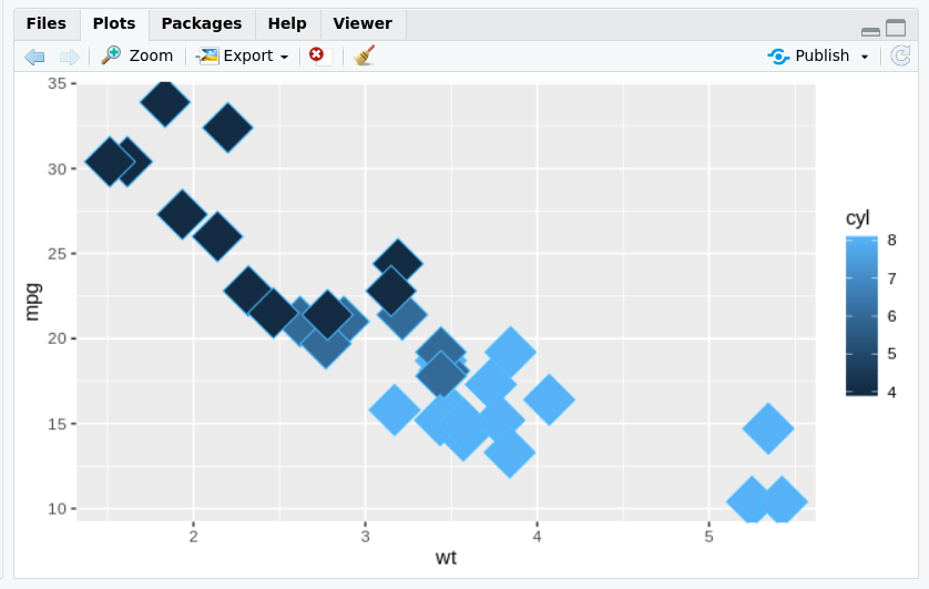
Exercise 5: Change shape and Size
# include ggplot2 library
library(ggplot2)
# Define a hexadecimal color
change_color <- "#4ABEFF"
# Set the fill aesthetic; color, size and shape attributes
ggplot(mtcars,aes(x=wt,y=mpg,fill=cyl))+ geom_point(size=10,shape=23,col=change_color)
OutPut: